![]() polski
polski
![]() polski
polski
ZARYS International Group is changing its image: we have just started rebranding. This is an important moment for us. We are opening another chapter in the history of the ZARYS International Group.
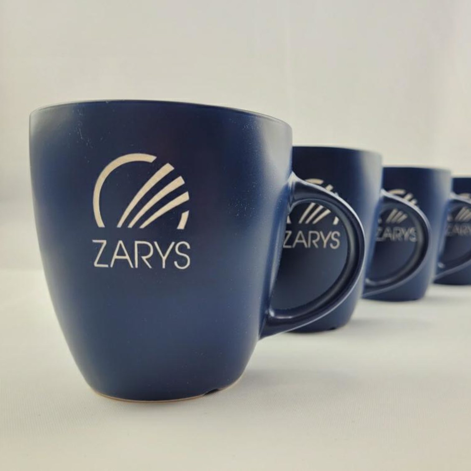
The previous logotype was created 15 years ago. Moving and geometrically rearranging the diagonal elements in the logotype resulted in a more conscious and stable sign. Subtle minimalism creates a safe graphic framework and redefines the name of the ZARYS brand adding to it the substantiveness acquired over time. The basic meaning of the word "zarys" (a Polish word which means "outline") refers to a dynamic nature and an infinite structure. Translated into the activities of the ZARYS company, it means growth, long-term business development strategy taking into account, in parallel with business activities, the brand purpose, that is, the deeper, non-material purpose of the brand's existence. The most important thing for us is to improve the quality of life of patients and to ensure the comfort of work of medics. The refreshed image does not negate the Company's history and the Company's collected experience package, but it reflects the modern principles of brand building. The three shades of blue, which are characteristic of our Company, remain unchanged. We still identify with the symbolic meaning of this colour, that is, hygiene and freshness as well as dynamism, creativity and experience. We are guided by the slogan "We create good solutions".
The changes will include: logotype, updating our visual identification scheme, modification of printing materials and redesign of packaging units. Their primary goal is to facilitate quicker identification of sub-brands belonging to the ZARYS product portfolio.